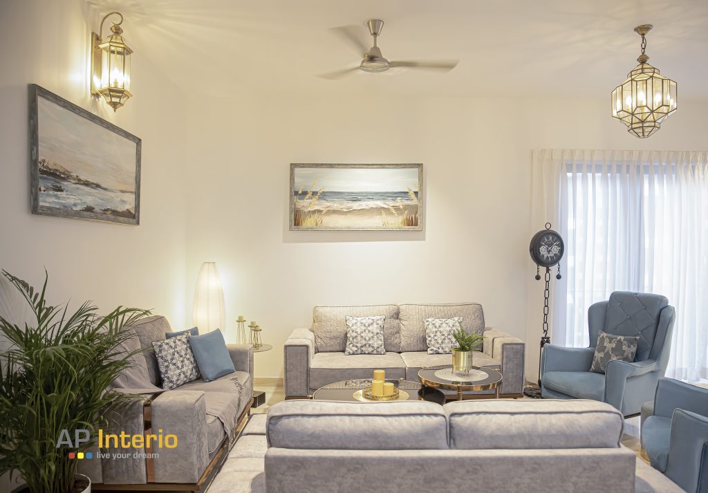
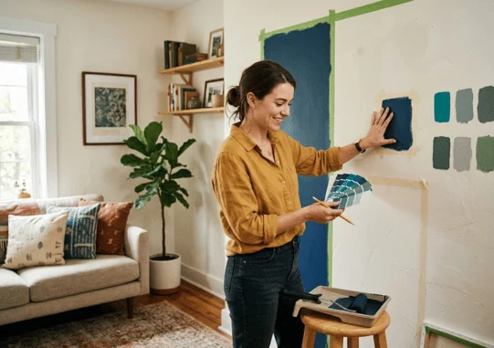
An accent wall works best when it strengthens an existing focal point. The right treatment can add depth, color, texture, and structure without redesigning the entire room. The key is to choose the wall first, then select a finish that connects with everything around it.
Quick answer: Choose the wall that already attracts attention, then strengthen it with color, pattern, or texture. Keep the treatment connected to the room’s flooring, furniture, lighting, and existing palette. For a current look, favor intentional materials and tonal contrast over a random bright wall.
| Design choice | Best for | Cost and effort | Visual effect |
|---|---|---|---|
| Paint | Bedrooms, living rooms, offices | Low | Color and contrast |
| Wallpaper | Bedrooms, dining rooms, powder rooms | Low to medium | Pattern and personality |
| Wood slats | Living rooms, media rooms, offices | Medium | Warmth and vertical texture |
| Board and batten | Bedrooms, dining rooms, entries | Medium | Architectural detail |
| Stone or brick veneer | Fireplaces, media walls, dining areas | Medium to high | Strong texture |
| Peel-and-stick finish | Rentals and temporary updates | Low | Flexible, removable change |
Key takeaways
- Choose a natural focal wall instead of the largest available surface.
- Test paint and materials under daytime and evening lighting.
- Connect the feature to existing furniture, flooring, artwork, or trim.
- Use texture when a single block of bold paint would feel disconnected.
- Keep surrounding décor quieter when the focal surface carries a strong pattern.
- Renters should confirm lease rules before applying paint, panels, or adhesive coverings.
What Makes a Feature Wall Work?
A successful feature wall gives the eye a clear destination. It may frame a bed, fireplace, sofa, dining table, television, or architectural detail. Without that connection, a contrasting surface can look like an unfinished decorating decision.
The treatment should also belong to the room’s existing palette. A dark green surface may connect with plants, upholstery, artwork, or warm wood furniture. RoomDome’s interior design guide also emphasizes connecting comfort, color, texture, and personal style throughout a space.
Modern focal surfaces can be quiet or dramatic. Tonal paint, molding, wallpaper, wood, plaster effects, tile, and stone can all create definition. The best choice depends on the room, not a single decorating rule.
How to Choose the Right Accent Wall
Start by standing in the doorway and noticing where your eyes naturally land. That surface often provides the strongest starting point for a feature. Beds, fireplaces, television areas, and large furniture pieces frequently create an existing visual center.
Avoid picking a surface only because it is large or empty. Windows, several doors, or awkward openings can break a pattern and weaken the effect. A cleaner wall usually gives paint, wallpaper, molding, or paneling more visual control.
Use this simple process before buying materials:
- Find the natural focal point. Identify what people notice first when they enter.
- Check the wall shape. Favor a clear surface with limited visual interruptions.
- Study the room’s light. View the wall during morning, afternoon, and evening.
- Connect an existing color. Pull from furniture, rugs, artwork, flooring, or textiles.
- Choose the finish last. Decide whether paint, pattern, or texture best supports the room.
Room shape also matters. In a long room, emphasizing the far short wall can visually reduce the tunnel effect. A strong treatment on a long side wall may emphasize the room’s narrow proportions instead.
12 Focal Wall Ideas That Feel Current
You do not need a loud paint color to create a strong focal point. Texture, subtle tonal shifts, and architectural details can provide more lasting interest. These options work across traditional, transitional, modern, and casual American interiors.
- Tonal paint: Choose a deeper version of the surrounding wall color for subtle contrast.
- Muted navy: Pair deep blue with warm whites, natural wood, brass, or tan upholstery.
- Earthy green: Use olive, moss, or forest tones with beige, cream, and wood finishes.
- Limewash-style texture: Soft color movement can add depth without a strong pattern.
- Large-scale wallpaper: Use botanical, geometric, or abstract prints behind a clear focal area.
- Board and batten: Painted millwork creates architectural interest in otherwise plain rooms.
- Picture-frame molding: Simple trim adds detail while keeping the color palette restrained.
- Vertical wood slats: Narrow wood elements can bring warmth to media rooms and offices.
- Stone or brick veneer: Textured masonry suits fireplace walls and rustic-modern interiors.
- Built-in shelving: Paint shelves and their backing together for a strong architectural feature.
- Gallery treatment: Use coordinated artwork to create focus without changing the wall finish.
- Peel-and-stick covering: Removable wallpaper can give renters a lower-commitment option.
A greenery treatment can also add strong texture where maintenance isn’t practical. RoomDome’s statement greenery ideas include ways to use artificial plants as focal features. Keep the surrounding accessories restrained so the greenery remains intentional.
Best Choices for Each Room
Different rooms create different focal points, so one solution will not suit every space. Bedrooms usually organize around the bed, while living rooms may center on seating, media, or a fireplace. Dining rooms often benefit from a feature behind a table, buffet, or artwork.
| Room | Strong wall choice | Suitable finishes | Color direction |
|---|---|---|---|
| Living room | Fireplace, media area, or sofa wall | Paint, wood, stone, molding | Olive, navy, charcoal, warm neutral |
| Bedroom | Headboard wall | Paint, wallpaper, paneling | Sage, clay, muted blue, warm brown |
| Dining room | Wall behind table or buffet | Wallpaper, molding, rich paint | Burgundy, green, brown, deep blue |
| Home office | Desk backdrop | Paint, shelving, wood slats | Green, blue, charcoal, warm gray |
| Media room | Screen or entertainment wall | Dark paint, wood, acoustic panels | Charcoal, navy, deep brown |
| Rental | Clear bedroom or living-room wall | Removable wallpaper | Muted pattern or tonal color |
Media and recreation rooms can handle deeper finishes because the design already has a clear activity center. RoomDome’s man cave ideas show how lighting, storage, furniture, and wall treatments can support one focal zone. The same principle works in family rooms and gaming spaces.
Choose Color Around Light and Existing Finishes
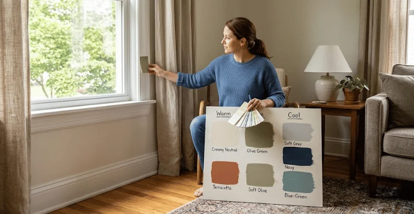
Paint can change noticeably as daylight shifts across a room. A color that feels balanced at noon may appear darker or cooler after sunset. Test a large sample and check it beside the flooring, trim, curtains, and major furniture.
Warm rooms often suit clay, brown, olive, muted terracotta, and creamy neutrals. Cooler palettes can support navy, blue-green, charcoal, and subdued gray. Your existing finishes should guide the undertone more than a trend forecast.
Contrast also affects how dominant the wall becomes. A near-tonal shade creates gentle definition, while a much darker color produces a stronger focal point. Choose the contrast level based on how much attention that area should receive.
Paint, Wallpaper, Wood, or Molding?
Paint offers the easiest starting point because it is affordable and simple to change. Wallpaper adds pattern and can provide more character without construction. Wood and applied molding add physical depth, but they require more planning and installation.
Permanent materials deserve more caution because replacing them takes additional work. Before installing panels, consider electrical outlets, wall-mounted televisions, baseboards, and existing trim. RoomDome’s home improvement ideas guide offers broader planning ideas for coordinating decorative work with other upgrades.
Renters should choose removable treatments carefully. Adhesives can react differently with painted drywall, especially on older or recently painted surfaces. Test a small hidden section and review your lease before installing anything.
Common Mistakes That Make the Room Feel Unbalanced
The most common problem is choosing a wall without considering the room’s natural focal point. Another is selecting a dramatic color before checking how it relates to furniture and flooring. These decisions can make the treatment feel separate from the rest of the design.
Watch for these issues.
- Choosing a random side wall because it has the most empty space.
- Using a strong pattern beside equally busy furniture or artwork.
- Ignoring natural and artificial lighting.
- Picking a color from a tiny paint chip without testing it.
- Adding several competing focal points in one room.
- Using materials that do not suit the room’s moisture or cleaning needs.
- Installing permanent panels without planning outlets and mounted equipment.
A room usually feels calmer when one feature receives visual priority. Let secondary furniture, accessories, and artwork support that feature rather than compete with it. This creates a clearer relationship between the focal surface and the rest of the room.
Do Feature Walls Work in Small Rooms?
Small rooms can still support a focal surface when the placement feels deliberate. A darker far wall can add depth, while a tonal finish can create definition without heavy contrast. Large patterns may also work if furniture and accessories remain simple.
Avoid assuming that every small room needs pale colors. Dark shades can create a cozy effect, especially in bedrooms and offices. Lighting, ceiling height, room shape, and furniture scale affect the result more than room size alone.
For tiny rooms with several architectural features, you may not need a single highlighted surface. Continuing one color or wallpaper around the room can sometimes produce a more unified result. Compare both approaches before committing to the one-wall treatment.
Are One-Wall Features Still in Style in 2026?
Current design coverage shows a genuine split, not one universal rule. Some designers criticize the arbitrary high-contrast painted wall, while other current guides favor purposeful focal treatments using texture and architectural detail.
That distinction matters because the design concept has changed more than it has disappeared. A disconnected bright wall may feel dated in some interiors, while wood, wallpaper, molding, stone, and tonal paint remain useful tools. The room should give the feature a reason to exist.
Use the idea when it improves hierarchy, frames furniture, or adds needed texture. Skip it when the room already has strong architecture, dramatic artwork, or several competing features. Good placement will matter longer than any yearly trend.
Frequently Asked Questions
What is the best accent wall for a small room?
Choose the surface that creates the clearest focal point from the doorway. The wall behind a bed or the far end of a narrow room often works well. Use tonal color or controlled contrast if you want the room to remain visually calm.
Does the feature wall always need to be darker?
No, a focal surface doesn’t have to be darker than the surrounding walls. Lighter paint, patterned wallpaper, natural wood, or molding can create distinction through texture instead. The goal is visible separation that still connects with the room.
Can wallpaper work on only one wall?
Yes, especially when the pattern frames a bed, dining table, or other central feature. Large-scale designs often have enough visual strength to stand alone. Keep nearby artwork and accessories simpler when the wallpaper already carries strong detail.
Can a living room have more than one focal feature?
It can, but the features should not demand equal attention. A fireplace may remain primary while artwork or shelving supports it. Repeating strong treatments on several unrelated walls can make the room feel fragmented.
Build the Room Around One Clear Idea
Start with the room’s natural focal point before choosing paint samples or materials. Then connect the finish to colors and textures that already exist in the space. This approach makes the finished room feel planned, not decorated one wall at a time.
Test temporary samples before committing to paint, wallpaper, or permanent paneling. View them under the lighting you use throughout a normal day. Once the focal surface feels connected, finish the room with quieter supporting details.